Financial heatmaps have been a staple in every serious investor’s toolkit. They enable tracking the exchange flow, specific to sectors and individual stocks.
Over time, heatmaps have also evolved to fulfill the changing needs of the market and its players. So much so that there are 3D heatmaps in the pipeline, leveraging virtual reality and whatnot. A study found that 3D heatmaps would allow observing 2x metrics in 50% of the time compared to 2D ones.
However, in this article, we’ll stick to the traditional 2D ones only while discussing the relevance and change in use in the market of 2026. The following sections will also discuss how stock heatmap calculators work, common mistakes beginners make while using them, and some best practices.
But first, let’s clear our concept around what trading heatmaps exactly are.
KEY TAKEAWAYS
- Heatmaps are a straightforward and intuitive share market tool.
- The encapsulated color-coded boxes of varying sizes and shades depict the performance and capitalization of the stocks.
- Investors use them to quickly gauge exchange sentiment, sectoral movement, and stock performance.
- Use fundamental analysis and other indicators in conjunction with heatmaps.
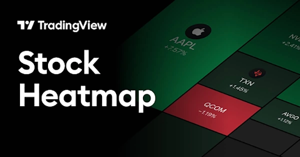
Heatmap is the name of the game if you want to easily understand the market situation through a 2D visual graphic. The size and color of the encapsulated rectangular tiles define the key metrics and performance of the corresponding share or sector.
Traders and investors use the stock heatmap frequently to quickly and easily gauge which stocks or sectors are gaining (green) or losing (red). The more the momentum, the more intense the respective color.
You have to take into consideration that the data that heatmaps convert into easily digestible color-coded tiles is:
It’s just a question of taking a glance for investors, and they get to know what the situation is around:
The mapping done by heatmap calculators is actually simple. The percent change decides the color (positive green and negative red) and its intensity (the magnitude of the percentage). The tile size is determined by the market capitalization of the stock/sector.
For quick and granular performance analysis, the following features are a must in a top-tier heatmap:
Heatmaps make it quite easy for investors to gauge stock exchange mood, where capital is moving, sector rotation, trends, momentum, and volatility.
The exchange sentiment is clearly depicted by a “sea of red” (fear/bearish) or a “sea of green” (greed/bullish).
Investors quickly gauge what the market mood is today by just a glance at these heatmaps.
Heatmaps depict price performance and volume intensity, helping investors identify market trends and momentum, precisely in sectors and individual stocks.
Observing the heatmaps over time allows investors to identify trends by looking at the pattern of shade intensifying or fading.
In a sectoral heatmap, the stocks with the highest or lowest returns are often highlighted.
Just like market trends, sector volatility can also be gauged through longitudinal observation of the heatmaps.
If a sector heatmap fluctuates its colors more frequently and intensively than the overall stock exchange, it’s clearly high-risk but high-reward at the same time.
Sector rotations can be spotted by observing multiple sectoral heatmaps for a couple of days.
The strengthening sector would become greener, while the dampening sector would get more red over time.
FUN FACT
While being around for over a century, the term “heatmap” was trademarked by Cormac Kinney in 1991, as he developed financial market heatmap software (Source).
Heatmaps are a powerful and intuitive tool. However, beginners don’t always get the point of heatmaps and misinterpret them. This leads to poor trading decisions on their part, and the blame falls on the harmless heatmaps.
Avoid these mistakes and use the heatmaps effectively by:
Now you’re quite familiar with stock heatmaps, one of the most intuitive tools in the arsenal of financial tools.
The encapsulated color-coded boxes of varying sizes and shades depict the performance and capitalization of the stocks. But make sure you interpret them clearly: green means performing well, and red means poor performance. Neither should you rely on heatmaps alone. Use fundamental analysis and other indicators in conjunction with them. Tile sizes are as important as the colors and their intensity; many beginners don’t register it.
Professional investors regularly use them to quickly gauge exchange sentiment, trends, volatility, sectoral movement, and share performance. They typically go from broad to specific: market -> sector -> stock. In addition, they tinker with the time ranges to identify trends better. Most beginners just leave that setting at 1-day. That’s all for today.
Spot the next big mover. May the colors be with you!
The 2026 exchange is all about cautious optimism.
TradingView offers the most feature-rich heatmap tool in 2026.
The rule advises selling a share if it drops below 7% of the original purchase price.