BI-powered visual storytelling improves user engagement by simplifying how complex data is presented to them and making websites more interactive and user-friendly.
Visual elements such as charts, dashboards, and animations can keep visitors engaged for longer than usual.
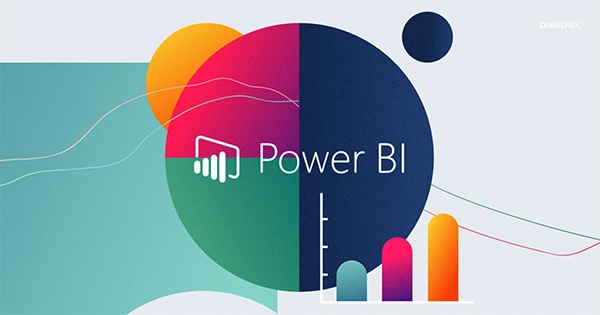
You can display images to Power BI within web applications to enrich the user experience with visualized data on customer behavior, location trends, or product analytics.
Balancing design and usability is necessary to ensure that the visuals are not only functional but also emotionally appealing to the viewers.
Its visuals boost engagement metrics, such as time on page and interaction rates.
“Without data, you’re just another person with an opinion.”
– W. Edwards Deming (Data Scientist)
Have you seen those websites that hook people with their dashboards? Or any charts that tell a story instead of showing numbers? Not sure about you, but they are really eye-catching for me.
In fact, not just for me, but for many others also. No, I am not saying it randomly. But a report shows that the websites integrating data visualizations see a 25% increase in user engagement and a 15% improvement in conversion rates. (Source: MoEngage)
I know you must be thinking about how these visuals are so damn effective. Is it all about aesthetics, or is there some strategy behind it?. Well, all your questions will be answered, so don’t worry. But the first thing you have to understand is our digital world has reached a place where data is everywhere, and making it easy and quick for audiences to grab is a unique selling point now.
This article explores more about how you can use the power of business intelligence tools, or say BI-Powered Data Visualization, to turn raw data into valuable insight right inside your web design. Get to know more about this smarter side of web designing.
Enhancing User Engagement Through Visual Storytelling
Storytelling has always been a powerful way to connect with audiences alone. And the moment it is combined with visual elements like interactive charts, animated graphs, or heatmaps, it becomes even more powerful to keep visitors engaged.
How? It gives readers an intuitive experience, with all the highlighted points and real-time trends, so they do not have to go through tiring static reports.
Simplifying Complex Data for Better Comprehension
A block of text or spreadsheets with too many numbers can be overwhelming for users, though these BI-powered tools are made. They break down such complex data into digestible visuals through funnel charts, histograms, or comparative KPIs. This complete process makes consuming information easy for users.
This approach improves the time spent on a website while encouraging more visits, as anyone will love to visit a site again that gave valuable information to them in an easy way.
Fun FactA study has claimed that people can remember 65% of visual information even after three days, compared to only 10% of written content. (Source: MedTech Intelligence)
Improving Decision-Making With Real-Time Insights
In this evolving time, nobody has time to find the data, so users expect to get up-to-date updates effortlessly. And this is now possible too by BI-powered visualizations. Yes, it directly taps into live databases and APIs to provide real-time information directly to the user interface.
Now, as people can find needed data related to everything, be it eCommerce analytics, financial trends, or user behavior patterns, so easily, the decision-making process will obviously become faster and more confident for both businesses and end users.
Integrating BI Tools for Seamless Visualization
When you integrate an advanced BI tool like Power BI, Tableau, or Looker into your web design, it helps developers process large datasets and translate them into actionable insights easily. These platforms are customizable and integrated with your UI, which means a smooth blend with your web design while maintaining functionality and performance.
Developers can also automate data extraction and then the creation of their visuals by using REST APIs and secure data connections. It will get refreshed and updated without any manual efforts.
Embedding BI Dashboards into Web Applications
A good BI dashboard can help you with a lot more than just reporting performance, like it can improve your user behavior, UX design, and creating a core component or hub for it. Not just this, if developers want, they can also dynamically display images in Power BI in applications to show geographic trends, product highlights, or customer demographics.
Basically, it can change any static app into an interactive ecosystem to cater to both users and stakeholders.
Fun FactJust like avocados🥑, dashboards are also best when they are fresh. That’s why real-time data feeds are now essential; like obviously, no one wants stale insights!
Optimizing Performance and Speed
These Data visualization tools can be resource-intensive for you, which will impact page load times and interactivity. But for this, you have to make sure that your bi assets are refined well while being embedded. So, don’t forget to compress datasets, lazy-load elements, and use CDN support for heavier scripts.
Rich features on the site are attractive, but only when they do not affect its speed and performance.
Designing for Intuitive Data Exploration
Designers should aim to create interfaces that invite or attract users to explore them instead of feeling overwhelmed. And by adding features like active states, hierarchical navigation, filters, and segmentation tools, it can be made possible, as it allows users to interact with visuals and draw their own insights.
Always remember, a good UX is what encourages users to explore more without any frustration.
Ensuring Mobile Compatibility
Nowadays, mobile responsiveness is becoming a crucial thing, as everybody is accessing data on their phones only. And to cope with this, data visuals should be made in a way that they can resize, modify, and simplify themselves according to the screen size.
For this, developers can also design a separate mobile layout or just use frameworks like Bootstrap and Flexbox with already embedded bi toolkits.
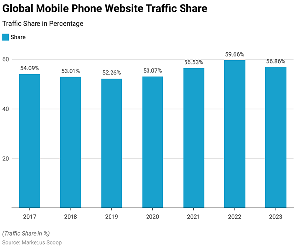
Intriguing insightsAs mobile web traffic is now over 58% of global usage, it’s mandatory to see if the BI visualizations are working smoothly on mobile devices.
Balancing Aesthetics and Functionality
Interactivity matters, but aesthetics matter too. Anyone will love to use a site that is beautifully designed with colors, typography, and white space effectively. It improves both visibility and trust of the users.
So if you are planning to get a site designed, make sure it has a good balance. As it will not just make your site functional but will also make it emotionally appealing, strengthening the brand’s message and credibility.
SEO Considerations for BI-Powered Visualizations
Search engines can’t read your dashboard and images as easily as they read text content. So while integrating things, be thoughtful about it. Adding descriptive alt tags, captions, and content-rich introductions around your visual elementson the site improves SEO.
Additionally, it also makes sure that any important data doesn’t go unnoticed.
Utilizing Schema Markup for Data Interpretation
Schema markups help search engines understand and categorize your visuals well. In fact, by labeling elements like charts, ratings, or statistics with appropriate structured data, your content can even appear in search results, improving visibility and CTR.
Enhancing Engagement Metrics
Visuals that attract users to click, scroll, zoom, or share can improve your engagement metrics like time on page, interaction rate, and return visits. And by tracking these behaviors through heatmaps and analytics tools, you can see what’s working for your site and what needs improvement.
The Future of BI-Powered Visualization in Web Design
The advancements in AI, big data, and UX are shaping the future of BI-powered visualization. And due to this, web designing is also continuously evolving and creating space for predictive analytics, natural language processing, and AI-driven customization.
The Rise of Predictive Analytics
Just think of a dashboard that is not just about current performance but also predicts the future for you. Well, as machine learning is getting integrated into BI tools, it is also an essential component for websites that are made for the purpose of business intelligence and strategy planning. In fact, by 2026, over 50% of business applications will have it embedded into their websites. (Source: Gartner)
Automation and AR
Automation is something that makes BI accessible through no-code tools and self-service dashboards. Meanwhile, AR is creating more ways for visualizing data in 3D environments. This will be a great help for people involved in real estate, architecture, and retail applications.
Conclusion
If you are planning to create a website and want modern web design, then keep in mind that a BI-powered data visualization tool is not a luxury but a necessity. Its features can change your website into a tool for interaction, education, and business growth.
With this, you have all the necessary information. So, now it’s up to you to decide what kind of digital experience you want to provide your users with!
FAQ
What is bi in web design?
BI in web design means integrating data analytics tools and dashboards to improve the way users interact with complex data.
Can I add a BI-powered dashboard to my website?
Yes, you can embed it by using iframe or JavaScript SDKs.
What type of website can use BI visualizations?
Finance, e-commerce, SaaS platforms, education portals, and news sites can use it for enhanced visuals.
How can BI visualizations affect SEO?
It improves SEO by increasing engagement, providing valuable insights, and enhancing the stay time of users on the website.