Let’s digest the reality: email marketing doesn’t give second chances. If your email looks weird in Outlook, breaks on a phone, or takes forever to load, your reader is gone. So is the sale.
In fact, with an estimated 376.4 billion emails expected to be sent and received worldwide each day in 2025 (Source: Meetanshi), standing out and making an immediate impact isn’t just a goal; it’s a make-or-break necessity.
Additionally, that could go back to as small a step as you couldn’t imagine in your worst nightmare. Case in point: Converting email templates from PSD designs. High-quality PSD to email conversion is more than slicing up a pretty file and clocking out.
Overall, it’s about translating a static layout into a dynamic, responsive, and inbox-friendly experience that cuts through the noise. Therefore, this article tells how to make that happen, step by step.
Let’s read it!
KEY TAKEAWAYS
- Begin with clear goals like what the email should achieve, who is reading it, and the desired action before design or coding.
- Create modular, simple designs with consistent spacing and typography, avoiding complex elements that won’t translate well to email clients.
- Only slice visuals; use HTML/CSS for everything else. Code with table-based layouts, inline CSS, and no JavaScript, specifically for email clients.
- Ensure designs fluidly adapt to all screen sizes (mobile-first is crucial) with proper image scaling, column stacking, and tappable buttons.
- Use tools and real devices to thoroughly test layout, links, accessibility, and dark mode rendering across all major email clients.
- Break down successful email designs into reusable components such as headers, footers, and content blocks to streamline future campaigns.
- Aim to translate your design’s intention into a dynamic, responsive, and high-performing email experience, not just a static copy.
Whether you are working with PSD to email conversion services or not, this step is a default. Ask the real questions before you open Photoshop or touch code:
If you overlook this strategic groundwork, you risk creating a visually appealing but ultimately useless email.
Pro Tip : Strategy is not extra. It’s the whole foundation. Skip it, and everything else wobbles.
Unfortunately, not all PSDs are designed the same. A form that looks sleek on a mood board can quickly turn into a nightmare in HTML if it’s too complex.
So, do yourself a favor:
The email server isn’t the web. It’s more limited, more fragile. Think: naiveness with a purpose.
Pro Tip : Designing exclusively for mobile devices isn’t a trend. It’s survival. Your audience is evidently on their phones.
Slicing is not about going Edward Scissorhands on your layout. It’s about precision.
Pro Tip : If it can be done in HTML/CSS, don’t slice it. Save cutters for visuals only.
INTERESTING FACT
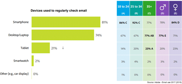
Over 40% of all emails are opened on mobile devices, emphasizing that a non-responsive or poorly rendered email template can instantly alienate a significant portion of your audience.
This is where countless designs lose their shine. Web code will not cut it—email clients are exceptionally fussy.
Pro Tip: Code with care for accessibility—use proper heading tags, alt text, and semantic structure.
A brilliant email that looks awful on mobile? Hard pass. Your design must work gracefully on every screen.
Pro Tip: Tools like MJML or Foundation for Emails help, but only if you know how to customize them well.
Even the most straightforward code can break in an unexpected way. That’s why surveillance is your safety net.
Pro Tip: Keep a checklist. Testing should be a standard part of your process, not a one-off.
You’ve put in the work, so don’t waste it. Break your final HTML into plug-and-play modules:
Seriously, store your modules in a shared feature library. You don’t require anything else to rebuild from scratch. You’re already engaged enough. Stop reinventing the wheel on every single campaign.
Pro Tip: Use version control like Git to manage updates across client projects or campaigns.
High-quality PSD to email conversion isn’t about simply copying and pasting a layout. It’s about translating intention into interaction. Every design choice, every line of code—each one shapes the overall experience your audience gets.
So start with strategy that include design with flexibility. Code for the real world and always test like your campaign depends on it—because it does.
When you do it right, you are not just converting a PSD. You are building an email that impresses, performs, and delivers. Literally.
Email clients have very limited support for modern web technologies. JavaScript won’t work, and CSS support is inconsistent, requiring older methods like table layouts and inline CSS for reliability.
Slicing is the process of cutting a large PSD design file into smaller image pieces that can then be reassembled using HTML tables in the email code.
Email clients display HTML/CSS differently, leading to unpredictable rendering. Thorough testing across various clients and devices ensures your email looks and functions as intended everywhere.
With most emails opened on phones, designing mobile-first ensures your email looks great and is easy to read and interact with on smaller screens, then scales up gracefully for desktops.

