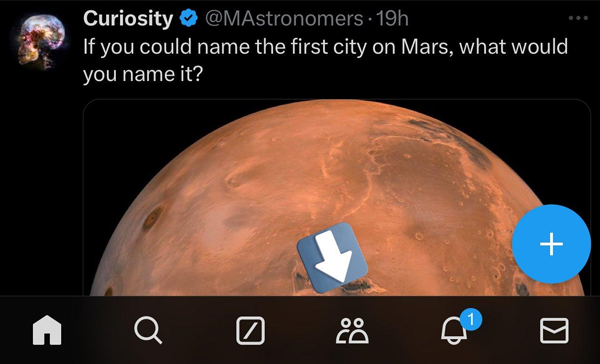
With five quick links already available in the nav bar of X, the company tests another bottom bar shortcut for Communities.
You can see this for yourself in this screenshot posted by X News Daily on X. We can clearly see the Communities tab placement right next to the Grok chatbot shortcut. The Grok shortcut was added to the nav bar late last year.

The new addition to the nav bar would make its 6th entry in an already cluttered space. When the company operated under previous management, they didn’t add more than four icons in the nav bar.
I don’t know much about the UI and design of an app and how many icons are considered too many. The previous management tried many options over the years but always reverted back to the four icons in the nav bar.
This new management at X is not afraid to try new things and even expand the way people use their apps. They are focused on maximizing the impact of communities on X. This March, X reported a 600% growth in Communities in the past year. Now, there are over 350,000 communities on X, and more than 650,000 posts are created every day.
So, this might be the reason why X is looking for ways to bring Communities to the front and this will increase engagement. We can assume that there is a demand for private chats or group discussions on X by looking at these numbers. This is precisely the reason why X has updated Communities several times in the last year or so.
