Apple has resolved one of the more obvious problems with Liquid Glass, its divisive new user interface design for the iPhone, iPad, and other Apple devices. It was unveiled earlier this month during WWDC 2025, with the release of iOS 26 Beta 2 on Monday.
Inspired by the optical features of glass, such as its light-reflecting ability and translucency, this updated user interface gives the operating system a modern touch. Early iOS 26 Beta testers, however, were somewhat quick to emphasize the flaws of the revised design in the first developer beta.
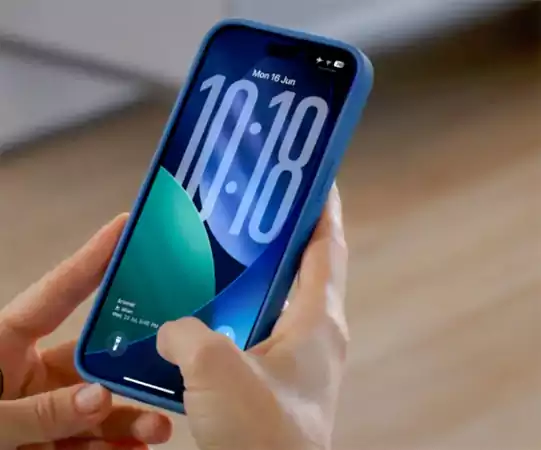
Users started sharing screenshots and expressing their criticisms about the areas where Liquid Glass had trouble, especially in terms of readability and usefulness, even if the beta version is still under construction. Users brought up a major issue regarding the near-unreadability of the Control Center, that is, the menu that shows when swiping down from the right edge of the iPhone, owing to its semi-transparent design. This made it difficult to separate the buttons and sliders on the Control Center from the icons and widgets shown on the iPhone’s Home Screen below.
Apple has fixed the Control Center problem in the newly released beta by changing the background blur, hence hiding the Home Screen material underneath. Many users noted, notifications in the first iOS 26 beta were also challenging to read. Although they seem slightly sharper in the revised beta, they still need more work, especially for clarity against brighter and paler backgrounds.
Given the autumn public launch of iOS 26, these changes are unlikely to be the ultimate ones. Still, they show Apple’s willingness to aggressively interact with early user comments and implement appropriate adjustments.
Additionally, in iOS 26 Beta 2, Apple has introduced an Accessibility area on the App Store’s product sites and activated iCloud synchronization for the Journaling app on iPads. It added order tracking functions to Apple Wallet, launched an Apple Music Radio widget, among other things.
