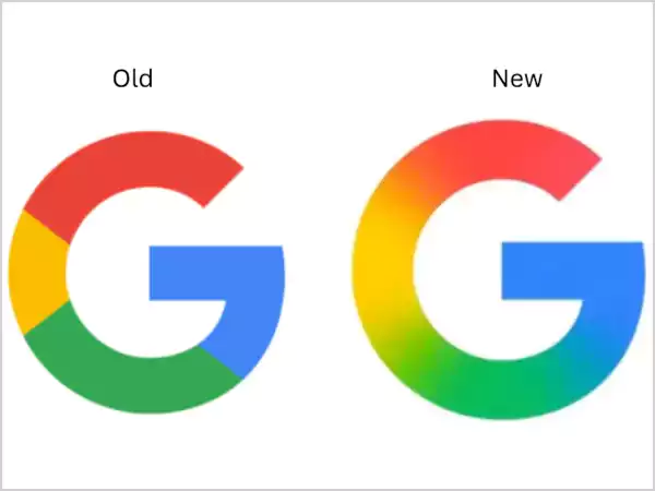
On the 12th of May, Google changed its ‘G’ logo for the very first time in nearly a decade. Gone were the solid blocks of color, replaced now by a gradient. This new version of the ‘G’ can be found in the iOS Google Search app, and it also made an appearance in an early developer build of the Android app, version 16.18 beta. It hasn’t popped up yet in any other Google branding avenues as of this writing on Monday. Whether the others will or won’t be updated as well is yet to be seen also the company has not made any remarks on the change yet.
Quite fittingly, the update arrives just before the Google I/O 2025 developer conference where Google introduced Material 3 Expressive Android design; scheduled to kick off on May 20. The color-block ‘G,’ previous incarnation, came into being in September 2015. It was in the same month that Google changed its wordmark to Product Sans and replaced the lowercase white ‘g’ on a blue background with the color-block ‘G.’
The company said in a blog post in 2015, “As you’ll see, we’ve taken the Google logo and branding, which were originally built for a single desktop browser page, and updated them for a world of seamless computing across an endless number of devices and different kinds of inputs,”
Back in 2023, in an interview with the company, Ruth Kedar- the designer behind the original logo of Google spoke about how early logos had a font that paid respect to design history teachings but embraced a vision toward the future.
The one-lettered ‘G’ logo has been updated for the first time since 2015, with a gradient modern design, a reflection of Google’s commitment to a newer and AI-powered future. It supports the feature look that the user base has grown fond of.
